The symbolic expression of language - the letterform, are among the most important reflections of a nation and its culture.
This is why a study of the Sinhala letterform and its development invariably becomes a reflection of Sri Lanka’s own evolution, and bears enormous significance to anyone who wishes to understand the island and its people.
Dr. Sumanthri Samarawickrama’s study of Sinhala typefaces and its development has an even deeper relevance — a way to share information, educate and inspire.
 Dr. Sumanthri Samarawickrama
|
Akura is presented in two concise sections - Origins and Anatomicals. It covers the makings of the Sinhala alphabet, the phonetic application of the Sinhala language that influenced the script, the division of the visual formation of the current letters and the terminology that defines Sinhala letter parts.
Akura also explores the role that tools and surfaces used to inscribe had on shaping the Sinhala letters, and the most recent history of the Sinhala typographical era, including the introduction of the printing press to the island and the technological developments of Sinhala typefaces. The most interesting, and perhaps also the most defining, aspects of ‘Akura’ are its insights derived from research and analysis.
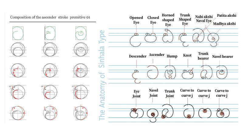
In the book, Sinhala letter anatomy is approached from the view that each letter is composed with its own unique visual properties, and the book delves into the original scientific study including the methodology invented by the author to identify the distinct visual properties of the letterforms and the proposed terminology to describe them.
It is with this knowledge on Sinhala scripts’ anatomy, that the visual variations of Sinhala typefaces are explored, along with the deriving of a set of root letters that future type designers and typographers can continue to develop and use, along with a methodology to define others or more.
Akura condenses and presents a vast volume of knowledge incorporating data, knowledge and insights from a well thought-out mix of researchers and authors. This includes veterans such as Prof. Wimal G. Balagalle, Prof. J. B. Dissanayake, Prof. K.N.O Dharmadasa, Dr. Tilak Kularatne, Keino Wickrema, Prof. G. Dalvi and Prof. Gihan Dias; institutes that contributed to Sri Lanka’s printed type evolution like Chithra and N. J. Cooray type foundries and Font Master by Pushpananda Ekanayake, as well as postgraduates of the Department of Typography and Graphic Communication at the University of Reading - Rafael Saraiva and Pathum Egodawatta.
Akura aims to fill a marked gap in the current body of knowledge on Sinhala typography. It is an essential guide to designing, learning and teaching Sinhala typography, and will hold the interest of history enthusiasts, typographers, designers, students, school teachers and scholars alike. ‘
Akura is the scientific approach that the growing discourse on Sinhala typography really needs right now.
“My vision for this research was always beyond it being an academic publication that gets read by limited scholarly circles. I believe this study has a larger role in reaching the masses and connecting the dots between the discourses on language, design, typography and history. This book ‘Akura’ sets out to do precisely that, with the help of the Sri Lanka-India Foundation,” said Dr. Samarawickrama.
Dr. Sumanthri Samarawickrama is a researcher on Sinhala typography, a senior lecturer at the Department of Integrated Design and director of the Faculty of Architecture Research Unit (FARU) at the University of Moratuwa.
She completed her PhD on the anatomy of Sinhala letters under the supervision of Prof. M. S. Manawadu, Department of Architecture, University of Moratuwa; Prof. R. Arangala, Department of Sinhala and Mass Communication, University of Sri Jayawardanapura; and Prof. G. Dalvi, Industrial Design Centre, Indian Institute of Technology (IIT), Bombay.
This academic study by Samarawickrama - The Anatomy and Historical Development of Sinhala Typefaces (October, 2016) - was featured internationally, with the most recent being at the ATypI (Association Typographique Internationale) 2019 conference in Tokyo, Japan.
Samarawickrama’s study captures the evolution of the Sinhala letterforms’ shapes and visual elements - specifically the printed, through an epistemological lens, and details a study of the Sinhala letter features and distinct visual properties.
In the printed form of the Sinhala letter, Akura documents type specimens from Colombo’s Department of National Archives, Mergenthaler Font Library, and Monotype and Linotype corporations in the USA.
This leads to what is perhaps the most significant contribution of this study - the identification of a root letters set that can rationalise the Sinhala type design process.